A business card is a crucial part of any professional’s branding strategy, as it is often the first point of contact between a business and a potential client or partner.
Keeping it’s importance in mind, people are always curious on the design and what information to include on a business card for an effective impact.
In this blog post, we’ll be discussing the golden rules of business card design and what info to include on the business card to help you create a professional and effective card that leaves a lasting impression.
Also Read: Business Card Size & Dimensions Guide UK – Free Templates & Design
Have a theme or running theme throughout the card
The theme of your business card should tie in with the branding or logo of your business. This means taking into account the colors, typeface, and layout used on both the front and back of the card.
For example, a business card for a fashion company should use colors and typefaces that are typical of the fashion industry. A good way to ensure that the front and back of the card complement each other is to use contrasting colors.
Also read: Key UK Small Business Statistics You Need To Know In 2023
Use text and logo sizes that are easy to read
It’s important to ensure that the text and logo on your business card can be easily read.
A good way to do this is to test print the card and hold it at a comfortable reading distance to see if the text and logo are clear.
Make sure your card is 300ppi and set to CMYK color mode for printing
To ensure that your business card is printed with high-quality colors, it’s important to make sure that it’s set to 300ppi and that the colors are in the CMYK color mode. This is a small but important detail that some designers may overlook.
Use bleeds on your design
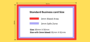
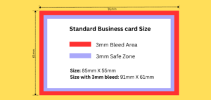
Bleeds are an important aspect of business card design as they help the printer to cut out the card cleanly and efficiently. Typically, a five-millimeter bleed should be used around the entire design.
Make sure that your artwork goes over the bleed, but not beyond it.
Use margins to keep content away from the edge
Margins are used to keep all important content, such as text and logos, away from the edge of the design. It’s a good idea to bring the margins in by five millimeters from the actual cutout edge to avoid a messy and unprofessional appearance.
Use hierarchy in the design
Using hierarchy in your business card design can help to draw attention to the most important parts of the card, such as your name and profession. This makes the card look more professional and neat.
In conclusion, these are the six golden rules of business card design that you should keep in mind while creating your card. Hope this will give you an idea on what to include on a business card.
By following these guidelines, you will be able to create a professional and effective business card that leaves a lasting impression on potential clients and partners.
