Are you looking for an easy way to create stunning, professional-looking posters on Word?
You have come to the right place! In this blog post, you will learn how to make beautiful posters on Word with a step-by-step guide. We will discuss all the necessary techniques to help you create amazing posters without having to hire a graphic designer. So, get ready to make professional posters on Word with this comprehensive guide!
Step 1: Choosing the Right Template for Your Poster
To choose a template, go to the “File” menu and select “New.” From there, you can search for “poster” templates or browse through the options provided. You’ll want to consider the purpose and audience of your poster when selecting a template, as well as any specific design elements you want to incorporate.
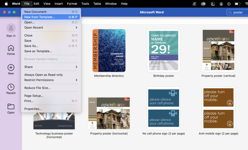
Once you’ve chosen a template, you can begin customising it to fit your needs. This might involve changing the colour scheme, adjusting the layout, or replacing images and text. Don’t be afraid to experiment with different templates until you find one that works best for your project.
Remember, a well-designed poster can make all the difference in effectively communicating your message. So take the time to choose a template that showcases your content in the best possible way.
Step 2: Customising the Layout and Size of Your Poster
Once you have chosen a template for your poster, the next step is to customise its layout and size. You can either adjust the existing template to meet your needs or create a new poster from scratch. Here’s how you can customise your poster layout and size on Word:
- Click on the ‘Layout’ tab on the Word ribbon. This will allow you to modify the size of your poster.
- Choose the ‘Size’ option from the dropdown menu, and select the desired poster size from the list. Alternatively, you can choose ‘Custom Size’ and enter the exact dimensions you want.
- If you want to change the layout of your poster, go to the ‘Page Setup’ group and click on ‘Margins’. Here you can adjust the margins to change the layout of your poster.
- You can also choose the orientation of your poster by clicking on ‘Orientation’ under the ‘Page Setup’ group. Select either ‘Portrait’ or ‘Landscape’ orientation depending on your requirements.
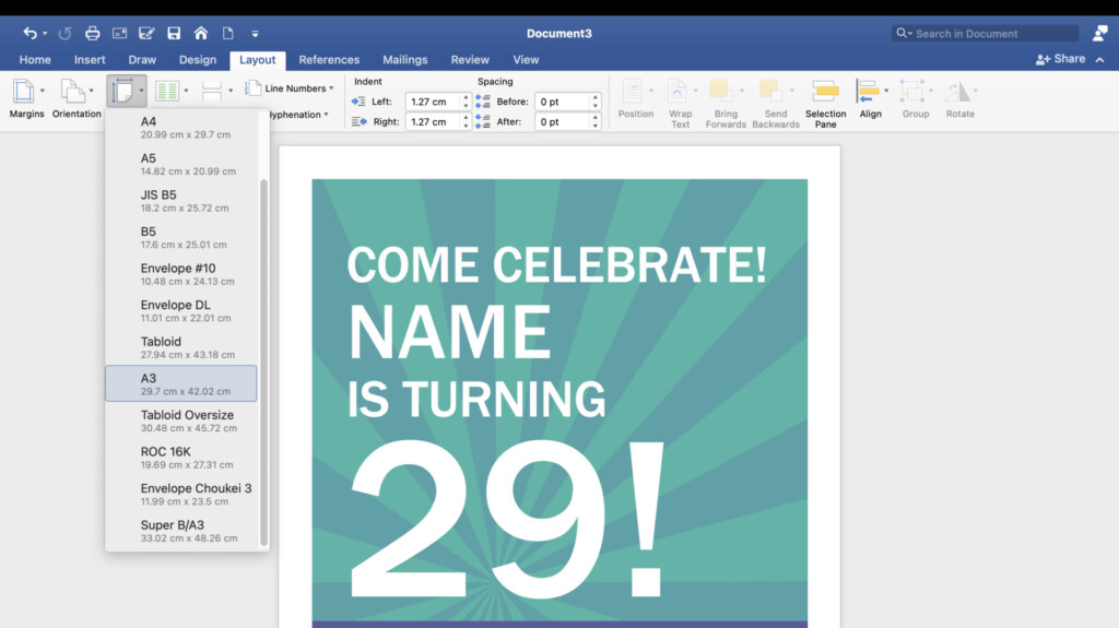
By customising the layout and size of your poster, you can create a design that perfectly fits your needs. Play around with different layouts and sizes to find the best fit for your message and content.
Step 3: Adding and Formatting Text on Your Poster
Now that you’ve chosen a template and customised the layout and size of your poster, it’s time to add and format the text. Here are some tips to make your text look professional and easy to read:
- Choose the Right Font: Choose a font that’s easy to read and fits the tone of your poster. Avoid using more than two different fonts.
- Adjust the Font Size: Make sure your text is big enough to be easily read from a distance. Headlines should be the largest, followed by subheadings and body text.
- Use Hierarchy: Organise your text in a logical order, with headlines first, followed by subheadings and body text. Use different font sizes and styles to create hierarchy and emphasise important information.
- Align Your Text: Align your text to the left, center, or right, depending on the design of your poster.
- Use Bullet Points and Lists: To make information more digestible, use bullet points and lists instead of paragraphs.
- Add Text Boxes: Use text boxes to separate and organise information. You can add a background colour or border to make them stand out.
- Proofread and Edit: Before finalising your poster, make sure to proofread and edit your text. Check for spelling and grammar errors and ensure all information is accurate and concise.
With these tips, you’ll be able to add and format text like a pro and create a visually appealing poster that effectively communicates your message.
Step 4: Incorporating Images and Graphics on Your Poster
Visual elements play a crucial role in creating an impactful poster. Adding images and graphics can help convey your message in a more compelling way. Fortunately, Word makes it easy to incorporate graphics and images into your poster.
First, select the “Insert” tab and click on “Pictures” to browse your files and select an image. Once the image is inserted, you can customise it by using the “Picture Tools” options, such as adjusting the size, position, and alignment. You can also add effects to your image, such as shadows and reflections.
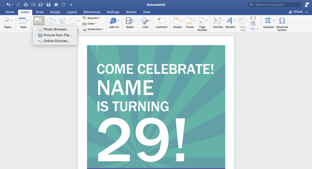
Additionally, Word offers a variety of graphics, such as shapes, icons, and charts, that can be used to enhance your poster. These graphics can be found in the “Insert” tab under “Illustrations.”
When adding images and graphics to your poster, make sure they are high-quality and relevant to your message. Also, consider the placement and size of your images and graphics to ensure they complement the text and overall layout of your poster.
By incorporating visual elements, you can create a professional and impactful poster that effectively communicates your message.
Step 5: Enhancing Your Poster with Colours and Backgrounds
Colours and backgrounds are essential components in designing a visually appealing poster. When selecting colours and backgrounds, it is important to consider the theme and purpose of the poster. Word provides users with various options for customising the colours and backgrounds of their posters.
To enhance your poster with colours, go to the “Design” tab and select “Colours.” Word offers various colour schemes to choose from, and you can also create your own custom colour scheme. When selecting colours, ensure that they are consistent with the theme of the poster and do not clash with other design elements.
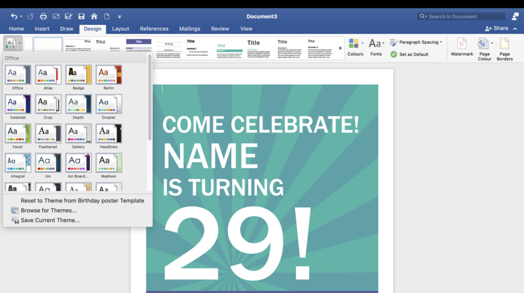
how to make a good poster on word
For adding background to your poster, go to the “Design” tab and select “Background Styles.” Word provides users with various background options, including solid colours, gradients, and textures. Select a background that complements the colours and layout of your poster.
It is essential to remember that when selecting colours and backgrounds, simplicity is key. Avoid using too many colours or textures that may overwhelm the poster and make it difficult to read. The use of contrasting colours and background can make the poster pop out, grab the reader’s attention, and enhance its visual appeal.
Step 6: Adding Shapes, Icons, and Borders to Your Poster
Now that you have customised the layout and added text and graphics to your poster, it’s time to add some finishing touches. Adding shapes, icons, and borders can help make your poster stand out and look more professional. Here’s how to do it:
- To add a shape, go to the “Insert” tab and select “Shapes.” Choose the shape you want to add and click and drag to draw it onto your poster.
- To add an icon, go to the “Insert” tab and select “Icons.” Choose the category and icon you want to add and click to insert it onto your poster.
- To add a border, go to the “Design” tab and select “Page Borders.” Choose the type of border you want to add and customise the settings as needed.
- To adjust the colour and style of your shapes, icons, and borders, go to the “Format” tab and use the options available.
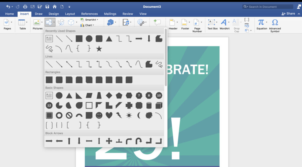
how to make a poster on word document
Adding these elements can help draw attention to specific areas of your poster or create a cohesive design. However, it’s important not to overdo it. Use these elements sparingly and strategically for the best results.
Step 7: Finalising and Saving Your Poster
Once you have completed your poster design, it’s time to finalise and save your work. Here’s how you can do it on Word:
Preview Your Poster
Before you save your poster, it’s important to preview it first. Check for any spelling errors, typos, or formatting issues. Make sure that all the elements are properly aligned and well-presented.
Save Your Poster
To save your poster, go to “File” and then click “Save As”. Choose the location where you want to save your poster, give it a name, and select the file format (PDF or JPEG).
Print Your Poster
To print your poster, go to “File” and then click “Print”. Choose the printer you want to use, select the number of copies, and set any print options you need. Check the preview to ensure that your poster will print correctly.
Share Your Poster
You can now share your poster online or print it for display. You can use it for events, presentations, or as a visual aid for your reports.
Making posters on Word is easy, fast, and convenient. Follow this step-by-step guide and you’ll be able to create professional-looking posters in no time!
